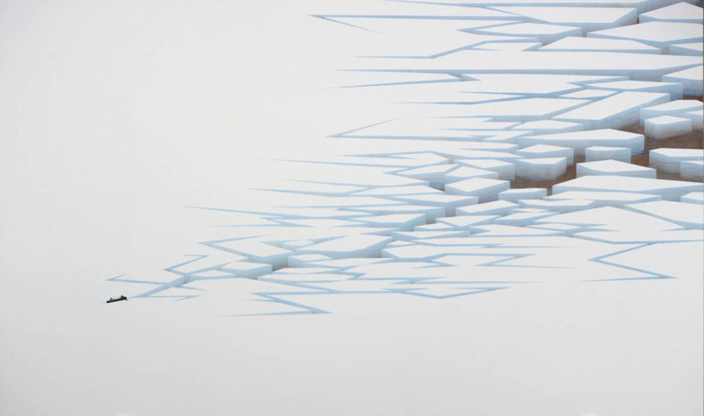
Westward Expansion (2009-2012)
Third floor, located in the Dean's Office.

ARTIST
Simon Hughes
watercolour and gouache on paper
42" x 70"
EXHIBITION HISTORY
Soundtrack: Volume 2
Division Gallery, Toronto
(27 March - 27 April 2013)
This geometric landscape appears vast and obsolete, aside from the small canoe that leaves a path of cracked ice in its wake. Westward Expansion is characteristic of much of Hughes' body of work, which often presents a humorous contrast of desolate Canadian landscape with a caricature of Canadian art and culture. Here, the caricature manifests in the presence of the two small paddlers.
Exhibition Information
Most artists work in solitude, but silence combined with rapt concentration can be tedious: the studio, once an exciting portal, turns into a confining cell. Therefore many artists use music as a vital tool, for distraction and perhaps even inspiration. This exhibition invites the viewer inside the sonic presence that inhabits the studio and perhaps, the artist’s psyche. All of the artists have provided a playlist of music that they listened to while working and an iPod and headphones will accompany the artworks. Do we see the contrast between Sade and doom metal in Allison Schulnik’s work? How does hearing Coltrane affect the viewing of Karel Funk's coolly detached portraits? Soundtrack examines contemporary art through the lens of music, creating a synaesthetic experience that reveals connections between sound and image.
Biography
Winnipeg artist Simon Hughes (Manitoba) brings humour and a modernist sensibility to classic themes of Canadian art. The subjects he revisits - wilderness, vast landscapes, the far north and its aurora borealis - have been appropriated by canonical artists such as the Group of Seven, perhaps to the point of being exhausted.
Working in watercolour, Simon Hughes revisits Canadian nordicity, using an obsolete aesthetic seemingly at odds with contemporary art theory. His technique, materials, colours, and geometric forms recall 50's graphic design, a self-consciously modern language from a period that firmly rejected traditional, canonical art. Exploiting these themes in an outdated, retro style, Hughes situates himself in two contradictory periods in art history and reconciles them with humour and nostalgia. The anachronism of the conflicting aesthetics gives the work its contemporary edge, the pictures he constructs imbued with a critical acumen otherwise lacking in traditional Canadian painting.
Biography and exhibition information courtesy of Division Gallery